Contents
Show/Hide
- 1958 Topps Rival Fence Busters - Willie Mays, Duke Snider #436
- 1950 Bowman Bob Feller #6
- 1956 Topps Willie Mays #130
- 1959 Topps Roberto Clemente #478
- 1953 Topps Mickey Mantle #82
- 1957 Topps Hank Aaron #20
- 1955 Topps Ed Matthews #155
- 1950 Bowman Jackie Robinson #22
- 1956 Topps Sandy Koufax #79
- 1957 Topps Ernie Banks #55
- 1951 Bowman Roy Campanella #31
- 1953 Bowman Pee Wee Reese #33
- Final Words On The Most Beautiful Baseball Cards from the 1950s
What is it about the 1950s that makes them so iconic? For years we heard these were the golden years of America. Today we know that was far from the truth. It was a time of great upheaval, inequality, and legally sanctioned racism. But the imagery of that period remains potent. Beautiful and massive cars made in America. Drive-in movies, soda shops, and Elvis Presley. The decade has also become arguably the most memorable and immediately visceral for baseball cards and the hobby.
When we think of the most beautiful baseball cards ever made, those incredible Topps sets of the 1950s are the first thing that comes to mind. Now granted, some mediocre sets and faux pas were released in that decade, just like any other time. But there is a reason baseball cards caught on as a national passion in this decade. The combination of innovative designs and excellent artwork, with the iconic players coming up at the time, made for an explosive combination.
When selecting the most beautiful baseball cards of the 1950s, I tried to look primarily at aesthetics. But of course, a lot of the appeal of baseball cards is who is on them. We get more excited by a beautiful Willie Mays card than a Monte Irvin card. So, there is a disproportionate number of stars here.
And with so many beauties to choose from, I may have missed your favorite. But hopefully, we will introduce you to a gorgeous card you weren’t aware of!
1958 Topps Rival Fence Busters - Willie Mays, Duke Snider #436
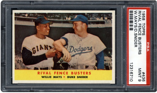
A PSA 9 sold for $4,351.
Don’t know about you, but I am a sucker for cards showing big stars together. And the 1958 Topps Rival Fence Busters - Willie Mays, Duke Snider #436 is absolutely historic. By this time, Duke and Willie had been centerfield stars for their teams for years. But in 1958, both of their clubs relocated to California, changing the baseball map forever. Two things stand out in this picture. First, the mutual respect and affection the two superstars had for each other. Second, the color scheme is dreamy and almost looks like one of the early 1950s illustrated cards.
1950 Bowman Bob Feller #6
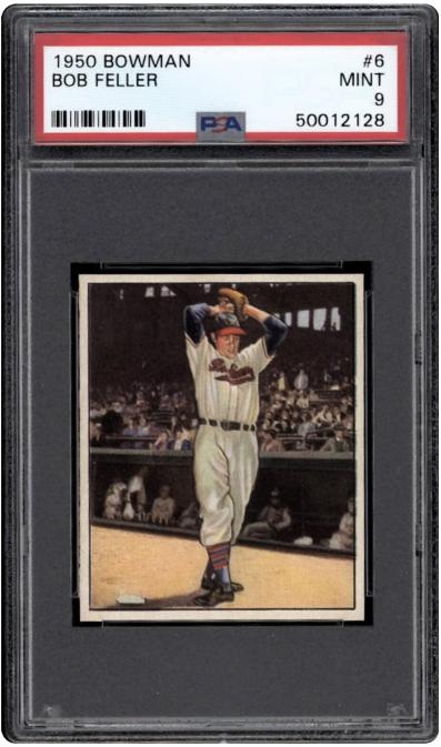
A PSA 9 sold for $5,174.
The best 1950s baseball cards tend to be illustrated rather than photographed, especially in the early part of the decade. And we can see a significant difference in the styles each one preferred. While Topps went for colorful realism, Bowman chose more subtle colors and a slight tinge of symbolism to their creations.
The 1950 Bowman Bob Feller #6 combines the best of both worlds. It showcases the pitcher warming up not far from the dugout. But it provides far more detail in the background, especially the crowd and players on the bench, than most cards in the dreamy 1950 release. The leisurely warmup motion of Bob Feller only hints at the tremendous power of "the Heater from Van Meter." But you know that legendary fastball is just waiting to be unleashed.
1956 Topps Willie Mays #130
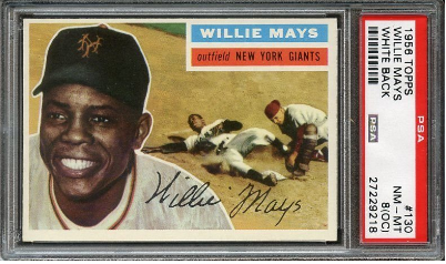
A PSA 7 sold for $2,075.
Hey, you gotta have the “Say Hey Kid” if you are doing the 1950s. Saying the 1956 Topps Baseball card set is the most beautiful card design of all time is like saying the best movie ever is The Godfather or Beethoven is the most brilliant composer. You are correct for saying so, but no one will credit you for originality.
Just about any card from this set could have been included in the list. But to me, the illustration of Mays sliding into home on the 1956 Topps Willie Mays #130, alongside that irresistible smile, make the most compelling case.
1959 Topps Roberto Clemente #478
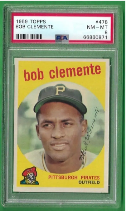
A PSA 9 sold for $15,000.
There is no shortage of absolutely gorgeous Roberto Clemente cards. Many would prefer his flashier cards in the 1955 and 1956 sets. At the same time, his card in 1971 Topps Baseball is one of the highlights of that legendary set. But the 1959 Topps Roberto Clemente #478 has a simple charm. It is also one of the most inspiring and flattering shots of the Hall of Famer and humanitarian hero in action. It could be how he loosely wears that cap or how Clemente looks off into the distance with a slightly cheeky smile. Either way, the card has incredible eye appeal.
Topps deserves enormous credit for the 1959 Topps Baseball design as well. After putting out flashy and busy designs in the middle of the decade, they did a great job dialing it down in this set. The circle shapes surrounding the images are now familiar but groundbreaking at the time. And the solid colors create an excellent contrast to these more personal shots.
1953 Topps Mickey Mantle #82
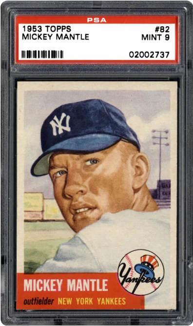
A PSA 9 sold for $396,000.
You know I had to put a Mickey Mantle on the list, right? Mickey Mantle’s cards are worth more than any other player of this decade (or probably any other decade), and the card companies took extra care in making his cards worth looking at. So, there really isn’t a lousy Mantle card to be found.
But the 1953 Topps Mickey Mantle #82 pops in a way none of the others can rival. These cards featured detailed portraits with a solid color border. The prominence of the team logo works wonderfully, putting the iconic Yankees symbol next to one of its most recognized heroes. The portrait is more complex than most Mantle images. It shows how immediately handsome the slugger was. But you can also see a current of tragedy and pain behind his eyes if you look closely enough. The sky and grass evoke the All-American magic of the Mantle era.
1957 Topps Hank Aaron #20
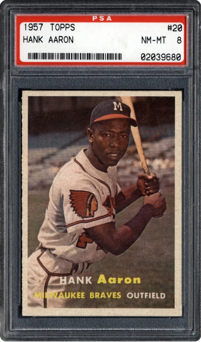
The best known, and most beloved Hank Aaron card is his rookie. It is also highly regarded from an aesthetic point of view. But there is a bit too much going on, and the picture of “Hammerin Hank” is not as flattering.
The 1957 Topps Hank Aaron #20 on the other hand, captures the promise of the young Hank (which he fully delivered upon), while also showing us that combination of grace and power that would allow the player to crush home runs and dominate the game for decades. The minimalist design makes this card pop.
1955 Topps Ed Matthews #155
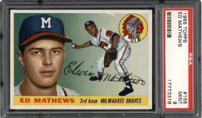
The 1955 Topps Baseball design was the culmination of the early designs of the card giant. It featured the illustrated dual image concept that Topps had become identified with. It coupled that with a shaded color background and the team's logos in the corner, rendered in vivid color. To offset all that pizazz, the lettering was generally minimalist. The result is one of the most cherished card designs ever unleashed on the public.
It was hard to pick a standout from this stellar release. But Ed Mathew’s card has a lot going for it. First, it's important to remind casual fans of just how good this 12-time All-Star third baseman was. Combining incredible defensive prowess with enough power to lead the league twice in home runs and finish his career with 512. He was also highly photogenic and therefore has been at the center of several beautiful cards. The picture of him working the hot corner is inspiring, and we can’t forget the presence of the politically incorrect (but breathtaking) old-school Milwaukee Braves logo. The 1955 Topps Ed Matthews #155 card just sings.
1950 Bowman Jackie Robinson #22
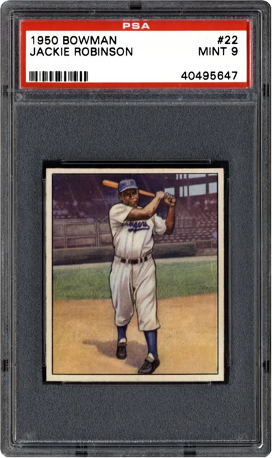
A PSA 9 sold for $117,000.
By 1950, Jackie Robinson had been playing Major League Baseball for three years. However, I cannot help but feel his early struggles inspired this card in the league. While many other cards in this release have crowds and teammates drawn in the background, the 1950 Bowman Jackie Robinson #22 notably does not.
That evokes how alone the Hall of Famer must have felt as the first Black player to break the color lines. Fighting against racism and discrimination at every turn. Yet, Robinson always kept his professional demeanor and never showed weakness, just like in this picture, where he methodically prepares to hit, despite having no one to root for him.
1956 Topps Sandy Koufax #79
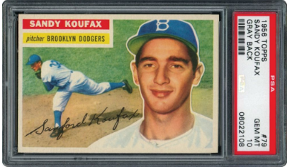
A PSA 10 sold for $45,860.
The 1955 Topps rookie card is better known, but the 1956 Topps Sandy Koufax #79 card is the best looking card of Sandy ever. Hands down. At the time, the young pitcher was wild and seemed destined for mediocrity.
But that knowing smile tells us Sandy Koufax knew he would get it together. And the action illustration captures the power and grace of his fastball delivery. And just look at how beautiful the grass looks. It really was greener in those days.
1957 Topps Ernie Banks #55
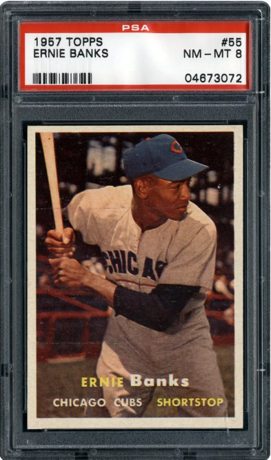
A PSA 10 sold for $39,600.
The 1957 Topps Baseball release excelled at top-notch pictures of players and contrasted them with white borders and simple but sharp lettering. The image of Ernie Banks on 1957 Topps Ernie Banks #55 really stands out. He had an incredible physique and truly mastered the art of the posed batting stance.
You will notice the red underline on the Cubs' uniform. They seem to have abandoned that quickly, and too bad! It really works. And when you see how assured "Mr. Cub" looks here, it is not surprising that he won the 1958 and 1959 NL MVPs. Ernie was ready to dominate.
1951 Bowman Roy Campanella #31
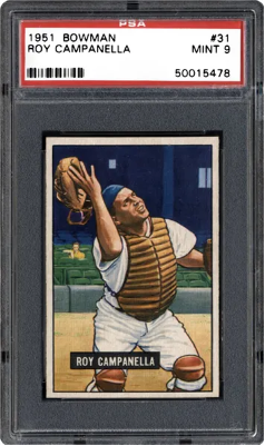
A PSA 9 sold for $9,417.
This card has a lot to unpack, which certainly qualifies as a work of art. Sure, the 1951 Bowman #253 Mickey Mantle is better known, but this card aesthetically has more going for it. First, the 1951 Bowman Roy Campanella #31 pays tribute to the ancient and beautiful tradition of catchers taking off their masks to catch a popup.
Second, look at how painstakingly the artist recreates the look of concentration on Roy’s face. It could not be more convincing. Finally, one fan in the stands is seemingly unimpressed with Roy Campanella’s efforts. The scene evokes Edward Hopper at his best, showing the tremendous distance between the crowd and the action. Whether this was intended or not, the card is devastatingly meaningful.
1953 Bowman Pee Wee Reese #33
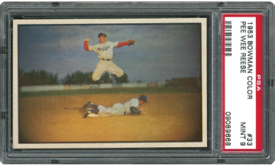
A PSA 9 sold for $26,533.
It was impossible to take genuine action shots back in 1953, so they were either drawn or staged. The 1953 Bowman Pee Wee Reese #33 is the former. However, what makes this picture work is different from the action element, at least not from my perspective. Rather its, the broad lens background making the image look bleak and isolating.
The story behind the picture is unexpected. It was not taken in 1952, like most of the photographs in this set. Instead, it was shot during spring training in 1946 at City Island Ballpark in Daytona, Florida. Indeed, it was a well-known picture that had been featured on the covers of several magazines in the past. And the player he is jumping over was likely Stanley George “Frenchy” Bordagaray, who was released by the Dodgers shortly after the photo shoot.
And let's take a second to appreciate the 1953 Bowman Color as a set. Because the boys at Bowman lost the war to Topps, we tend to enjoy their cards less. But this minimalist design of beautiful and vivid color pictures, with no frills at all, was bold and has stood the test of time beautifully.
Final Words On The Most Beautiful Baseball Cards from the 1950s
With groundbreaking designs and artwork from inspired artists chronicling the most iconic players ever to grace the diamond, 1950s baseball cards have unparalleled appeal. Each one of these cards is an aesthetic marvel. But with so many great cards and releases to choose from, we could easily make another list of cards just as attractive. But one thing I could never do, is make a list as impressive from any later decade. This was a golden era for baseball cards.
You might notice that none of the “TV design” cards made this list. That is a personal choice, I am not a fan of the design, which appears prominently on the 1955 Bowman Baseball release, for example. I recognize it was a bold design choice, but it does not work particularly well. Still, neither Bowman nor Topps put out a single design that could be described as substandard in the 1950s.
1.