Do you remember the 1970s? That was a time of disco, helmet-haircuts, and some of the cringiest football cards ever printed. While the 1970s has plenty to answer for in the fashion department, a lot of the worst football cards simply are a matter of poorly-timed photographs, comically-bad airbrushing in the days before Photoshop, and just lousy designs. While sports cards would get a more professional look in the 1980s and would get actually impressive in the late 1990s, the 1970s is full of cheesy and ugly cards with color schemes that would make modern graphic designers faint.
So, let’s take a fun tour through this era of cringe that will feel nostalgic if you remember it and will be a good history lesson if not. While you’re less likely to add them to your buy list than the Vikings are likely to go all the way this year (or any year?) Don’t worry, I say that as a longtime Vikes fan so I’m allowed.
The Top 10 Cringiest Football Cards of the 1970s
Here’s a nostalgic and cringefest list for the 1970s, with 10 of the worst of the worst. Even fans of these players have to admit that these cards do not do their legacies justice. Some are so bad, they’re actually funny to see. Let’s dig in!
10. 1972 Topps New England Patriots Randy Vataha #158
Randy Vataha seems to be our first airbrush victim. Who knows where they got this picture, but it seems like the braintrust at Topps in the 1970s decided that all they needed was his head and they could paint in a red shirt that was close enough to a Patriots uniform to fool fans? Of course, the lighting of the image makes Vataha look yellow with jaundice, the shadows on his shirt make the whole thing look fake, and his trademark 1970s helmet hair does help matters at all.
We’ll see more examples of this kind of thing later, where it seems like the card company might have missed the chance to catch the player on the day of their photo shoots so they just improvised. While modern Photoshop and generative AI tools can produce impressive, photorealistic pictures, this sad 1972 Topps New England Patriots Randy Vataha #158 card makes it clear the technology just wasn’t up to the challenge in 1972.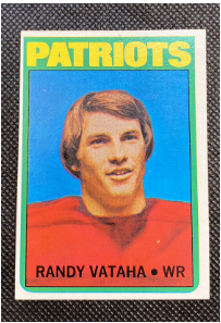
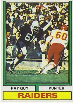
9. 1974 Topps Oakland Raider Ray Guy #219
Another lazy Topps photographer is responsible for this confusing mess on 1974 Topps Oakland Raider Ray Guy #219. Ostensibly, this is a card to recognize Ray Guy, a punter for the once-and-future Oakland Raiders. Yet, whomever was responsible for capturing the image to celebrate this particular player didn’t take the job too seriously. Instead, they took a sideline image that has two other players in the foreground that largely block your ability to even see Guy. Sadly, it’s right when the Raider punter is performing a pretty impressive kick. You’ll just have to imagine the glory of his action, though because he’s also a bit out of focus and the poor quality of the image means he’s lost in the sea of people in the crowd.
While the main feeling the card projects is for you to feel sorry for Ray Guy, as he’s barely featured on his own card, the whole photo is poorly composed as it fails to capture the action of the play, making for a truly lousy card that commands a surprisingly high price for such an ugly card. But if you have a copy and it’s properly graded, you can sell it for more than $1,000. That certainly beats having this lackluster card in your collection.
8. 1973 Topps San Diego Charges Coy Bacon #149
As if the unfortunately-named Coy Bacon wasn’t suffering enough from that hilarious name, Topps 1973 football card from his second year in the league, seemed to have been a bad airbrush job when he made the move from the Los Angeles Rams to the San Diego Chargers. His Rams teammate nearby kind of gives it away, but the interns cleaning up this 1973 Topps San Diego Charges Coy Bacon #149 card also couldn’t be bothered to add anything more on his uniform than just getting the colors…mostly right.
His comical stance in the photo is far from a winner, showing again that Topps wasn’t trying too hard to present players in their best light. As if to add insult to injury, the back of Mr. Bacon’s card has a trivia question about John Madden’s impressive first year as coach of the Oakland Raiders, a notable rival of both the teams Bacon was on. Ouch!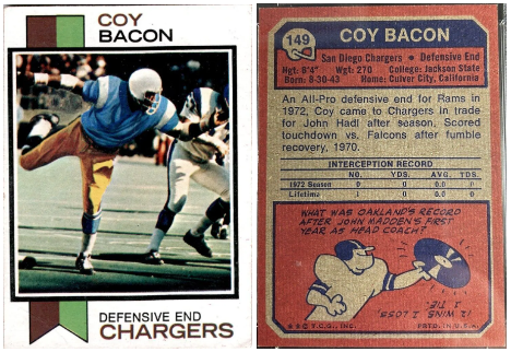
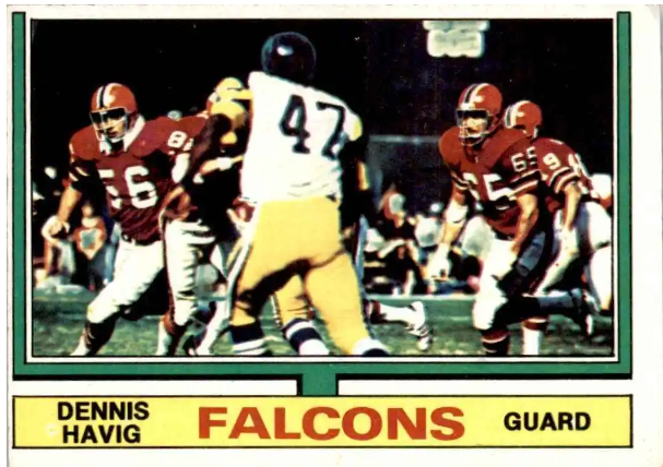
7. 1974 Topps Atlanta Falcons Dennis Havig #426
Another ridiculous mess of a card full of players with no discernible focus. Which player on 1974 Topps Atlanta Falcons Dennis Havig #426 is actually Dennis Havig? There are no fewer than four Falcons in the image, plus there’s what looks like a Pittsburgh Steeler with his back to us right in the middle of the picture. Mr. Havig is actually over on the left side of the picture, only identifiable if you happen to know that his jersey number is 56. That’s assuming you can tell it’s a 56 on that player, too.
Chalk up this confusing card to another Topps photo editor figuring anything is good enough. One gets the impression that they could just go to games without a proper shot list to capture everyone on the team, only to later comb through to find any picture at all for players they didn’t have a photo for. Topps is about to take back the rights to print NFL cards so hopefully they look back on this dark period in their printing history to remember how they lost the license before and never do it again.
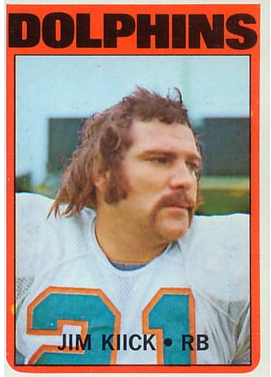
6. 1972 Topps Miami Dolphins Jim Kiick #9
Despite our many kickers, Jim Kiick is actually a running back. He looks to have been having a pretty tough day when it appears Topps’ photographers decided to take his picture for the 1972 Topps Miami Dolphins Jim Kiick #9 card. Clearly, the NFL didn’t have hair and makeup people nearby in the early 1970s to help him out. So what we get is a mightily sweaty mullet on a distracted RB. I’d be sweaty, too, if I was rocking sideburns so thick they look like the whiskers on a walrus.
Thankfully, it’s the only terrible card in his career. Most of the rest are action shots or solid headshots where he doesn’t look like he hasn’t been to the barber in a few years. Even so, this is his most popular card, likely because of the laughs it inspires.
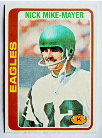
5. Philadelphia Eagles Nick Mike-Mayer #491
If it seems like we’re picking on a lot of kickers on this list, I blame the lack of interest in highlighting these vital players who might sometimes get forgotten in the shuffle. The unfortunate kicker-style helmet does play a role in this cringe-worthy shot of the Philadelphia Eagles Nick Mike-Mayer #491 card. The awkwardly-named “Nick Mike-Mayer” looks like he is cosplaying at Warner Brothers’ Marvin the Martian here. With his goofy smile and 1970s-style mustache, it’s just a reminder that no one really looked very good during the “Me Decad`e.”
Thankfully, some of the other cards that feature Nick Mike-Mayer from his career across a lot of different NFL and then USFL teams show him in action, clearing the ball impressively. Stick with those rather than this lackluster card or the others that focus on headshots instead of action on the field.
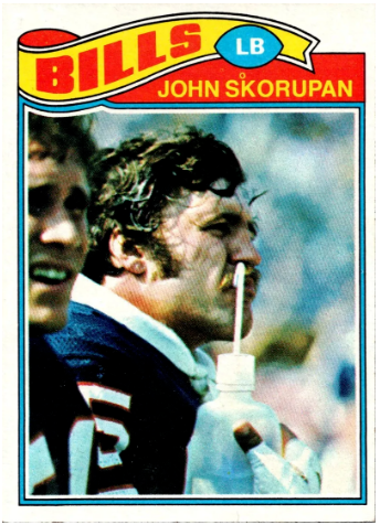
4. 1977 Topps Buffalo Bills John Skorupan #122
Was this really the best image of linebacker John Skorupan that the Topps photographers captured for their 1977 Topps Buffalo Bills John Skorupan #122 card? Did they try to take one where it doesn’t look like he was shoving a straw up his nose? Maybe they should consider capturing a picture where his hair is not sticking out in a dozen directions from the sweat of play. We like action shots on sports cards, but bench photos after the action are far less interesting.
What’s clear from this list of cringe 1970s football cards is that Topps did not have the highest standards or perhaps the clearest instructions about what they wanted in a photo of a player. Too often, it seems they combed through the photos they had (no cool modern apps to help them) to find a player they needed to feature, only to find they had subpar images that they just used anyway. Thank goodness this is no longer the case in the present day. Quality standards have improved immensely, not the least of which is due to the fact that so many cards are not being made into premium and exclusive limited editions. I cannot imagine a Panini Prizm Black card of a player with a straw sticking out of his nose.
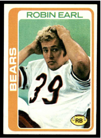
3. 1978 Topps Chicago Bears Robin Earl #32
Yet another card from the Department of Bad Timing, this surprise shot of Robin Earl is presumably capturing him while the Running Back is doing some sit-ups on the field before a game. The effect, however, is to make him look like he was trying to style or contain his 1970s blond curls while flashing a ‘come hither’ look. In truth, he was probably just startled that he was being photographed, but the image betrays his possible innocence in making this cheesy picture come to life.
The funniest part is that the 1978 Topps Chicago Bears Robin Earl #32 card almost looks like his reaction to seeing the card, holding his head in shame at being on one of the cringiest football cards ever.
2. 1975 Pittsburgh Steelers Roy Gerela #370
Unfortunate timing sinks another kicker’s card here. Why in the world would Topps decide that a headshot with Roy Gerela chewing on his nails be better than a photo of him kicking a football? He’s not smiling, looking tough, or even looking anything but angry…and hungry?
By the mid-1970s, Topps had figured out a better overall card design, with an attractive banner at the bottom, even if it’s weirdly off-color for the team. But their photographers were still turning in their worst work for the kickers. I cannot imagine that Gerela was happy with this picture on the 1975 Pittsburgh Steelers Roy Gerela #370 card either, since it makes him look like a grumpy benchwarmer who’s too lazy to get up and get a snack. This card belongs in Cringe City for sure.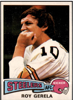
1. 1971 Topps Los Angeles Rams Jack Snow #44
Nothing on this list says ‘cringe’ as clearly as this embarrassing card from the 1971 Topps football set. Jack Snow, a wide receiver from the Los Angeles Rams, is shown in a painfully goofy pose as he’s ‘running’ down the field. Maybe we should call it ‘skipping?” His arms look oddly short, his head is tucked in with his huge shoulder pads, and the sidelong, uh, ‘smile’ makes this 1971 Topps Los Angeles Rams Jack Snow #44 one of the corniest cards ever to be printed on cardboard.
While some fun has been made of the unfocused shots Topps allowed into their card sets where you can’t tell which player is featured, actually making fake poses like this is so much worse. It’s pretty challenging to believe that Snow and his agent would approve this one, but clearly it went out to the card manufacturers and into the annals of the worst cards ever. It’s probably not surprising to know that during his 10 middling years in the NFL, Snow actually had a brief career in Hollywood, mostly in small roles. Maybe this was all his idea.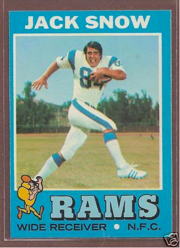
The 1970s Football Card Hall of Shame
As we wrap up our list of the cringiest football cards of the 1970s, let's remember that these cards are more than just a collection of mistimed photography, questionable hairstyles, and goofy antics. They provide a nostalgic walk down a memory lane paved with bad airbrushing and questionable mustaches.
Each card, in its own right, is a testament to a time when athletes were not just players, but unwitting fashion icons for a generation that clearly had a ‘unique’ sense of style. So, the next time you find one of these ‘gems’ at a card shop or tucked away in your attic, appreciate the grandeur that comes with so much cringe. Lists like this also help us remember that no matter how cool we think we are today, someone in the future is probably going to laugh at our choices, too. Happy collecting!