Are you old enough to remember the 1990s? That was a decade defined by grunge music, dial-up internet, and some truly cringe-worthy basketball cards. Smack dab in the middle of the Junk Wax era of sports cards, the 1990s birthed some iconic athletes an d memorable moments in sports, yet it sometimes presented them with some jaw-dropping bad designs. While the late 1990s would begin an era that would lead to better-looking sportscards and premium options that would carry us into the modern day, this list will show you some of the worst misfires from the world of 1990s basketball cards.
These cards are the visual equivalent of a Shaquille O'Neal free throw: So brutally bad it’s almost endearing. So secure your fanny pack and pump up your Air Jordans; you're in for a crazy ride through a hideous world of bad design choices and embarrassing photographs that belong in some kind of special Basketball Hall of Shame exhibit.
Yes, there are more than a few from the 1990 SkyBox basketball series, which are a notoriously hated set of cards. They were hardly the only offenders, because we’ve got some awful cards from Fleer, Hoops, and Upper Deck as well. Let the cringe-fest begin!
10. 1990 Hoops Gary Payton Rookie #391
Poor Gary Payton appears on our list twice, with this 1990 Hoops #391 Gary Payton
being embarrassing but not as bad as the other Payton card further up the list. We’ll forgive Payton for this one since it is a 1990 Hoops basketball card focused on his draft. He was a young player just drafted to the Seattle Supersonics in the early 1990, so it’s understandable that he accepted the suggestion of the Hoops team for the design of his goofy card.
Ostensibly, Gary Payton is supposed to be getting his call on a silly green phone from the Sonics to recruit him, for which he’s already wearing a hat from the team and an ugly suit with a matching tie? Who dresses this poor guy? Add to it the cringe-worthy gray background with the words 1990 NBA Draft on it and the mix of fonts and ugly use of borders that would likely appear in a good graphic artist’s nightmares and you have one hideous card to start our list.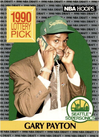
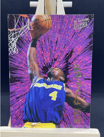
9. 1994 Fleer Ultra Chris Webber Purple Ultra Power /10 Insert
The sad thing about this goofy card from 1994’s Fleer Ultra Basketball set is that it feels like they were trying for the look that the Prime Metal Gems series would perfect later in the decade. Unfortunately, as it is, this lame card looks like a comic book showing the explosion of purple thoughts coming from Chris Webber’s mind as he goes for a shot. Was this inspired by someone’s illicit acid trip?
Webber’s expression doesn’t help matter much, with an open mouth looking like he’s about ready to slurp up some soup. The unreadable text over the cringey purple background of the 1994 Fleer Ultra Chris Webber Purple Ultra Power /10 Insert is just icing on this lousy cake. Webber certainly deserved better than this mess of a card.
8. 1990 Fleer Tim Perry #151
Perhaps this is just unfortunate timing. Tim Perry probably made hundreds of shots while looking cool. This time, he captured a stance that looks neither effective nor particularly powerful. If you saw this on the court, you might burst out laughing instead of covering this ‘small forward’. Could you take him seriously as a threat?
Add to the fact that he’s got short-shorts on that are probably leftover from the 1980s’ inexplicable fad and it’s just not a great look. Fleer photographers of the time certainly did not understand that their photos should make basketball players look mighty, cool, and handsome. Poor Perry probably got a lot of ribbing from his team for his precious stance here and it certainly doesn’t look like there’s going to be enough power in that shot to make the basket. Here’s hoping Perry renegotiated his contract before they printed another card like this 1990 Fleer Tim Perry #151.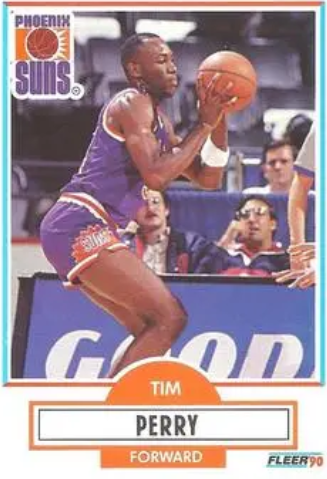
7. 1990 SkyBox Joe Barry Carroll #72
SkyBox’s 1990s series strikes again with this oddball card featuring the Denver Nuggets’ Joe Barry Carroll apparently playing on a basketball court for giants. The dead giveaway is that Carroll is 7 feet tall. With that arm all the way up, he should be a bit closer to a regulation NBA hoop, set to 10 feet. It’s just a dopey image that suggests the designer had no idea about the dimensions involved in a basketball court. It’s just kind of confusing and makes the card feel less like a real image.
Add to these details that they added a gold and red ribbon background and a hideous little logo for the Nuggets below, a team where Carroll spent about half a season of lackluster play and you have an unlovable card that poor Joe would probably love to see deleted from the world.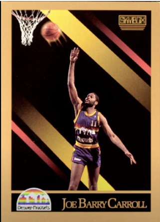
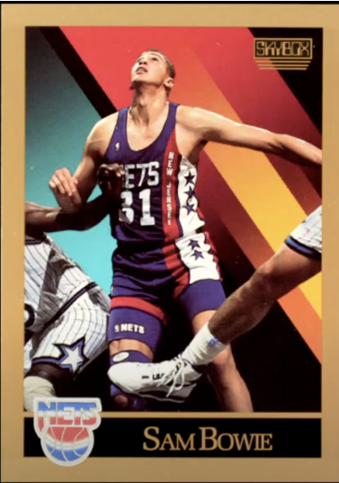
6. 1990 SkyBox Sam Bowie #177
As it happens, this hilariously weird photo appeared on the Sam Bowie card from the SkyBox series the same year that Adobe’s Photoshop debuted. Sadly, it seems that the folks at SkyBox didn’t get a copy of that first release. Otherwise, they might have used the newfound photo editing tool to get rid of this random player leg that cuts into the lower part of the image.
While we know fully that the other opposing player on the left-hand side of the card is a different person, there’s still a weird way in which it feels like the “Intruder Leg” could be the right leg of the same guy wrapped around. Add to all of this the garbage SkyBox backgrounds that are distractingly colorful and their sad ‘tech-y’ logo and you have a card even a mother can’t love.
5. 1996 Upper Deck Martin Müürsepp Rookie #245
While SkyBox is probably the prime offender for this list, Upper Deck had some cringe-worthy basketball cards in the 1990s, too. Few build on the embarrassing look of this image of Martin Müürsepp and his leap here. The totally unnatural look of the jump is only made worse by the awkwardly happy smile on his face. The whole affair feels like a low point for everyone involved.
While we know the NBA lockout of the late 1990s played a role, one does wonder if Müürsepp’s short career in the league before moving to overseas teams was precipitated by this horrendous rookie card. Not sure if Upper Deck was shipping cards overseas during that era but I wouldn’t be surprised if Müürsepp checked on that.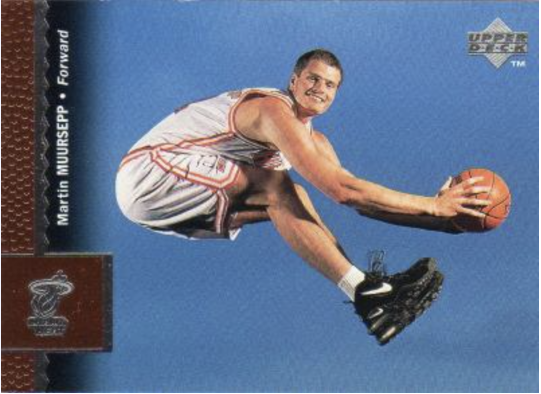
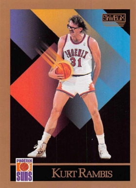
4. 1990 SkyBox Kurt Rambis #229
One of the worst of a terrible set, the uniformly ugly 1990 SkyBox set filled with simple colored geometric shapes and cheesy effects, Kurt Rambis’ #229 is a monstrosity for the picture they captured. Kurt Rambis was a killer defensive player for the Los Angeles Lakers during their powerhouse run in the 1980s. Known as “Superman” for his glasses that made him look like the superhero’s alter-ego, Clark Kent, Rambis was actually a rough-and-tumble player who would field rebounds and fight for loose balls.
This image, taken during his brief stint with the Phoenix Suns, shows him in aggro mode, with greased out hair and the thick black-rimmed glasses making him look like an old man yelling at kids to get off his lawn. The ridiculous effect on the basketball in his hand just makes the whole image look ridiculous, all while reducing Rambis tough-guy persona to a cartoon character.
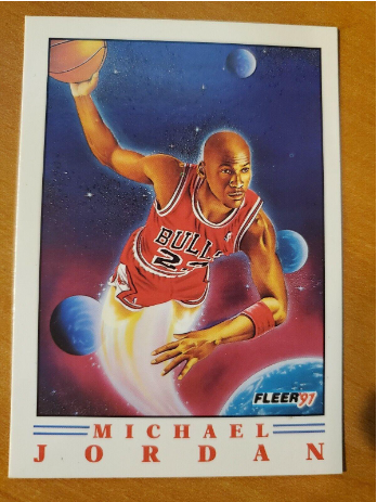
3. 1991 Fleer Wheaties #70 Michael Jordan
Being the GOAT won’t save you from truly bad ideas for a basketball trading card. His Airness Michael Jordan is featured on this ridiculous 1991 Fleer Wheaties #70 Michael Jordan card that Fleer made for Wheaties. At least you got a healthy box of cereal along with this cornball image of the greatest basketball player ever, umm, soaring into space? The image makes no real sense unless there is some extraplanetary hoop that I’m not aware of.
As it is, Jordan seems to be propelled into space by rocket-like legs, ready to fire off the basketball towards, I don’t know, an asteroid? Where exactly he is with all of these planets closeby makes little sense. This one reeks of bad design along with player managers who aren’t doing a great job of managing their brand because the amazing Michael Jordan has maybe never looked sillier. That said, this is probably the most expensive card on this list because, come on, it’s still Michael Jordan.
2. 1990 Fleer Gary Payton
We promised a second Gary Payton card and this 1990 Fleer Gary Payton makes the cheesy staged ‘draft phone call’ one look pretty good. While action shots usually make the best basketball cards, photographers need to make sensible decisions about when they capture images. In the heat of a game, it’s often that players get close to one another in ways that are likely to inspire a laugh out of the context of the game.
This 1990 Fleer basketball card is a prime example in that Payton is simply playing his game, using his body to block another player from taking the ball from him. Unfortunately, the other player got really close and placed a hand on Payton’s torso in a way that looks…compromising. The less said, the better. The charmless font and lettering designs certainly don’t help prop up this embarrassing card. Regardless, one can only imagine that Gary Payton would be okay with wiping out all his 1990 basketball cards that simply don’t reflect the solid player he is.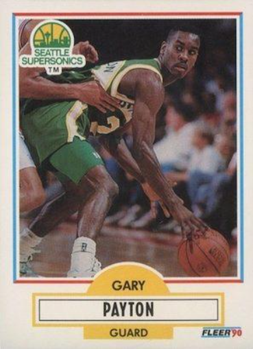
1. 1996 Upper Deck Elliot Perry #250
While SkyBox is the MVP for this list of wince-inducing basketball cards, we need to award Upper Deck the top spot for this absolute cringe-fest of a collectible. Do they know their target audience is kids and basketball fans?
This mock-sexy image of Elliot Perry sitting in a tub of tube socks is the epitome of bad and any regular collector is likely to get a quick case of facepalming when they see this card. The whole idea of this image is embarrassing - placing Perry in a tub rather than on the court, covering him with socks, and even that cat-ate-the-canary grin on his face. Why in the world did they think this was a good idea? I can only imagine the kind of taunting Perry must have faced after this comically bad card came out. Why would anyone want to lay down in a tub full of socks? They look clean enough but it’s still just a little bit of maybe Perry trying too hard to be cute.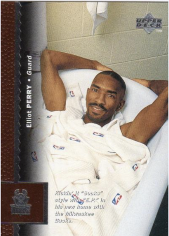
The 1990s Basketball Card Hall of Shame
During the 1990s, basketball card companies seemed to have gone off the deep end, indulging in terrible photography and over-the-top designs that left collectors scratching their heads. However, as the decade drew to a close, a welcome change started to take place. Card designs began to shift towards a more tasteful and refined aesthetic. The 2000s brought with them a breath of fresh air, introducing gorgeous card designs and cool upgrades that still captivate collectors to this day.
In retrospect, we can't help but cringe at the 1990s cards. They epitomized a strange and temporary phase in the history of basketball cards. But they also serve as a reminder of the ever-evolving nature of the hobby, where trends come and go, and what was once considered trendy can quickly become outdated.
So, let's cherish the 2000s and the beautiful card designs they brought forth, while acknowledging the peculiar allure of the 1990s cards. They may not be everyone's cup of tea, but they hold a special place in the annals of basketball card history.