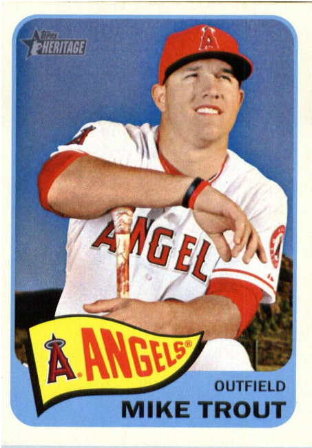
There are several Topps releases that focus almost exclusively on bringing back retro card designs. Topps Heritage (my favorite) and Topps Archives are the two best-known. But just about every baseball card release has some retro and nostalgic elements. For example, the Topps flagship release has inserts with callbacks to some of their best past designs. And collectors love it. After all, baseball is a tradition and history-rich game. Its fans love delving into the past far more than those of other sports.
But while we all like nostalgia occasionally, it can all get very tiresome in the wrong hands. Seeing the same uninspired rehashes of old-school cards is boring. But there is a reason companies keep doing it. When it works, retro designs still pop and bring something new to a traditional format. To help you separate the wheat from the chaff, we bring you the best examples of the most fantastic baseball card designs of the past, brought back with an ultra-modern twist.
2014 Topps Heritage Baseball
The Topps Heritage set always reprises one of the classic designs that the company is known for. We don’t usually consider the 1965 Topps baseball set one of their absolute best. But somehow, that somewhat overlooked set's minimalist (for the time) look really pops in the Heritage setting. You also must remember that the 2014 Topps Heritage Baseball set was overlooked when initially released because it didn’t have the greatest crop of rookies. However, we must say some of these rookies aged very well. Especially the Joe Morgan dual card with Sonny Jackson.
The front of the card is classy and has the name and symbol of the relevant team in a pennant. A great touch of classic Americana. But the back of the cards really set the 1965 Topps Baseball release over the top. The top of each back had a cute and creative cartoon personalized to the player. It wasn’t the first time Topps had used this little gimmick. But they had never put this much effort into it and never would again. Fans of the original design were delighted to see Topps put effort into recreating the wonderful cartoons for modern players.
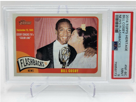
But one card in this set did not age well as the one commemorating Bill Cosby breaking the TV color line in 1965, especially since it showed the now convicted sex offender getting a kiss on the cheek from a woman with a big self-satisfied grin on his face.
Fleer Tradition Baseball
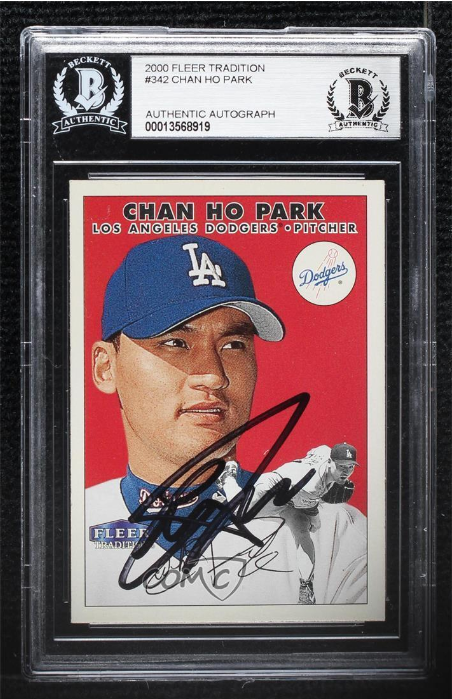
While initially designed to be the main Fleer flagship set, in 2000, Fleer Tradition Baseball pivoted to a nostalgia type of brand. It had bigger success in its basketball version, notably featuring the famous LeBron James, Carmelo Anthony, and Dwayne Wade triple rookie card. But we have to give the set its due. It served as the inspiration for the Heritage Topps release, which first arrived one year after Fleer Tradition moved completely into the nostalgia lane.
Much like the Topps release, Fleer Tradition took classic Fleer designs and used them to feature modern players. For example, in 2000 the set used the design of 1981 Fleer for the cards. It did a beautiful job too. Of course it got Topps thinking about their rich back catalog of designs. But Fleer did it first. The last set was released in 2006. Fleer was on its last legs, having been bought out by Upper Deck, who distributed the set. It's time to bring it back!
2008 Topps Heritage Baseball
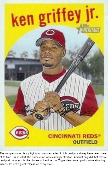
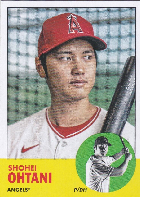
It's always interesting how the Heritage reprise products that work best aren’t always the most popular and beloved ones of the past. After all, what worked best in the olden goldie days doesn’t always pop in a modern context. One example of that is the 1959 Topps Baseball design, used skillfully for the 2008 Topps Heritage Baseball release.
The original set is best remembered for leaving a relatively small picture in a rounded sphere, surrounded by bold colors. The player team and position appeared in traditional lettering at the bottom of the card, next to a beautiful rendition of the team symbol. However, Topps went adventurous by putting the player's name on top at a slight angle.
The company was clearly trying for a modern effect in this design and may have been ahead of its time. But in 2008, this same effort was startingly effective. And not only did that classic design do wonders for the players of the time, but Topps also came up with some stunning inserts. It's just a great release on every level.
2022 Topps Archives Baseball
While Heritage has a more structured feel, Topps Archives brings a wider variety of tribute designs. Traditionally, that release has also included a good number of reprints of classic cards. However, it has thankfully moved away from that towards vintage interpretations of modern player cards.
While the cards in the Vintage release usually have significantly lower value than the best Heritage ones, that doesn’t mean they don’t pack a wallop with their traditional designs.
The 2022 Topps Archives Baseball release did particularly well in this regard. It paid tribute to the 1963 and 1978 Topps baseball designs in base, with a bunch of inserts from other years. The best among those was the 1987 Foil insert.
2019 Topps 1984 Style Inserts
Heritage uses vintage designs as the basis of its base card set. That is cool but means that there is no special excitement that comes with pulling the card. The flagship set utilizes the vintage designs differently. The bigger release uses the cards in limited sets, often with low-numbered parallels, making some of the most exciting cards in the set.
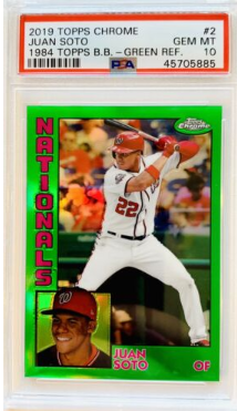
Every year these inserts stand out. But the 1984 Style Inserts in the 2019 Topps baseball release look fabulous. When the cards came out in that notable year (in terms of fiction and Van Halen albums at least), they were hailed as one of the best of the time. It's easy to see why, with the small headshot on the bottom left-hand side. Meanwhile, a fetching action shot took up most of the real estate. Of course, the cards were all white which made them a bit boring.
Therefore, it was highly pleasing to see Topps make the 1984 style inserts in a wide array of colors. The refractors were especially cool. It also helped that 2019 was a much better year for rookies than 1984 had been. So we get Ronald Acuna Jr. and Vlad Guerrero in this set.
2022 Topps Baseball 1987 Style Inserts
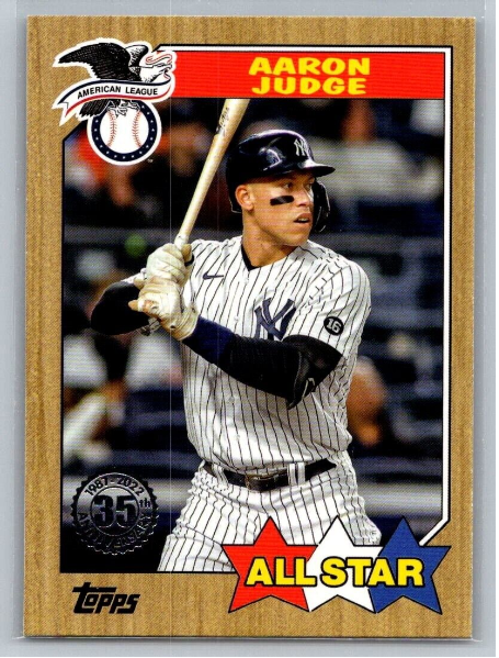
The 1987 Topps basketball set had that iconic wood paneling design. It looked like the wall paneling for every steak restaurant in the 1970s, and seemed pretty quaint at the time. But like so many of these vintage designs, they can really pop in an ultra-modern context. Those of you with a good memory may remember it was first used in a flagship release back in 2017. But Topps did a much better job in 2022. They faded the paneling to make it look more hardcore and added a plethora of parallels and refractors. The results were fabolous.
2005 Topps Heritage Baseball
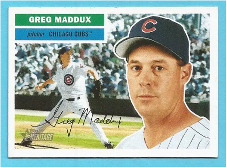
As we all know, Heritage always centers around one of the Topps classic designs. The best-known and most beloved design of all is the iconic 1956 Topps Baseball one. It featured a player profile picture as the main visual component. But what really set these cards apart was the spectacular background. A hand-painted color action scene made up the rest of the card and included some of the best artwork in Topps history.
Recreating this design would always be an uphill battle for the creator of the 2005 Topps Heritage Baseball set. But we have to give Topps the utmost respect on this. They managed to do a respectable job of bringing this absolutely legendary set to life. Yes, they did not go through the painted illustration route. That was a shame on one level. But on the other hand, it's hard to believe they could have found artists on the level of the original release anyway. So, instead, they used beautiful action shots with stark color and nailed the faux autograph style of 1956 Topps. Well done.
2020 Topps Project 2020 Baseball
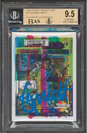
Topps Project 2020 was an incredibly ambitious one. It had a checklist of 400 classic Topps rookie cards remade by a group of notable artists. There was a ton of buzz surrounding the release at the time. The promotion managed to generate buzz through its release format. Two new cards were issued every 48 hours. You could get one for $19.99 each or both daily cards for $34.99. Every now and then, you would strike big by getting an auto or limited edition version of the cards. Some people invested a lot of money in these cards and were disappointed that they never gained all that much value.
But on an aesthetic level, the results were fascinating. The items in the checklist varied wildly from some of the most beautiful cards I have ever seen to some of the ugliest ever made. The series is a testament to baseball cards' creative limits (or lack thereof). For example, take a look at this gorgeous artistic recreation of the George Brett rookie card.
Donruss Diamond Kings
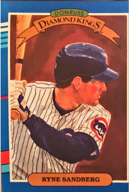
Donruss has never been the biggest name in the baseball card business. But they carved out a niche with their 1980s products. The highlight of those releases was easily the Diamond Kings inserts. These were lovingly painted portraits of the stars of the time, and they truly stood out in the “junk wax” landscape. So they brought in Baseball Hall of Fame artist Dick Perez to do them. The results were beautiful. Sure, we are not talking about the level of art we saw in 1950s Topps. But the cards were a massive hit. Perez would continue to draw them until 1996.
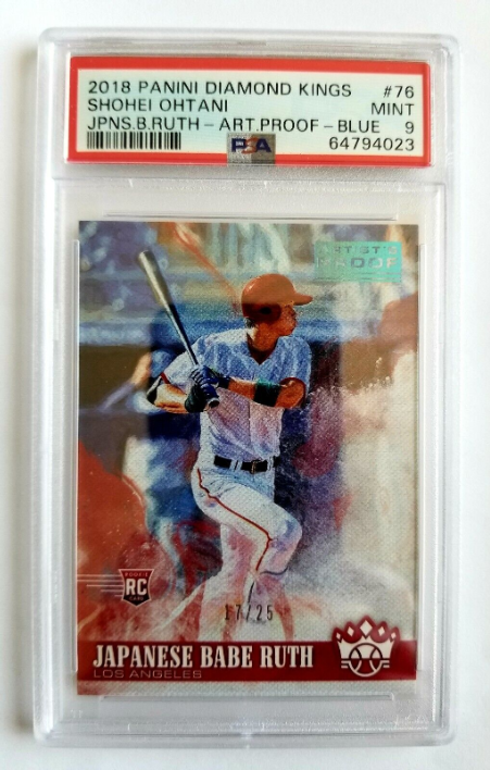
After a card company named Playoffs bought the rights, Panini brought it home to Donruss in 2009 when they bought the company and its name outright. Starting in 2015, the Diamond Kings cards were brought back, using photograph images touched up somewhat to look like a painting. But that isn’t what the series is about, and collectors were unimpressed. In 2019, Panini brought back the old-school painted Diamond Kings concept using new artists since Perez was semi-retired.
The new pictures are quite different from the classic ones. The cards are also unlicensed, which lowers their market appeal. But I think it works well. It is faithful to the original idea of beautiful art to represent current baseball stars.
Topps Project 70
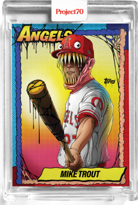
This may be controversial, but I prefer Topps Project 70 to the original Project 2020. A sequel is rarely better, but call these cards Godfather II because they achieve that tall order. Here Topps gave the artists even more creative freedom. They allowed the artists to use the entire vast catalog of their cards and even mix and match athletes with the designs from other years. The results vary wildly in quality, just like Project 2020. But because of the greater freedom, the best cards are even cooler.
Easily the biggest splash in this series was made by the cards of Alex Pardee. He turned baseball stars into a series of awesome monsters. The Mike Trout card, in particular, has become iconic. Although watch out, because it also has the highest print run and is therefore unlikely to hold on to its value.
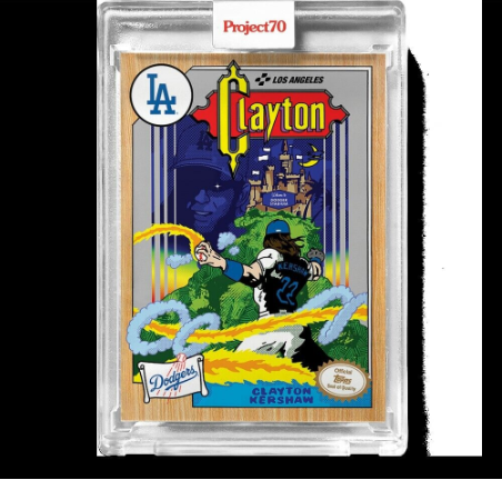
My personal favorite is the take by Ermsy. His Clayton Kershaw card is so stunning I bought a copy and always have it on display. Just look at the epic fantasy style he brings to the subject.
Final Word On The Top 10 Coolest Retro Designs for Classic Baseball Cards
Sometimes card companies run out of ideas. After all, so many sets of baseball cards have been released over the years it can be hard to find new ideas. But as we have seen here, classic designs can inspire fantastic creativity. The classics provide a solid base for reimaginings, parallels, and even surrealistic art. You can never go back to the past. But you sure can get inspired by it.
